19:00
Telegram will add a built-in Gram Wallet for fee-free crypto transfers

13:35
EU fines AliExpress €550 million over illegal and unsafe products

12:00
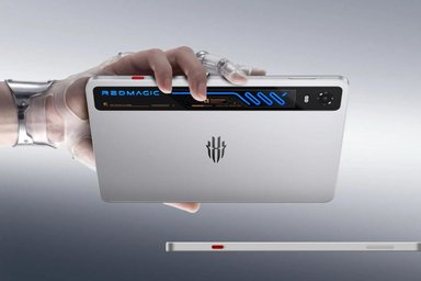
RedMagic Astra 2 matches ROG Xbox Ally X gaming performance

10:38
Thousands of AI-generated fake books appear on Apple Books and Amazon

08:00
Hugging Face reveals cyberattack carried out by autonomous AI agents

09:00
Apple abandons high-end Mac Pro chips, plans refresh of entire iPad lineup
19:00
Telegram will add a built-in Gram Wallet for fee-free crypto transfers
13:35
EU fines AliExpress €550 million over illegal and unsafe products
12:00
RedMagic Astra 2 matches ROG Xbox Ally X gaming performance
10:38
Thousands of AI-generated fake books appear on Apple Books and Amazon
08:00
Hugging Face reveals cyberattack carried out by autonomous AI agents
09:00
Apple abandons high-end Mac Pro chips, plans refresh of entire iPad lineup

Despite being widely known as a successful mobile phone brand in the public's perception, Nokia aims to break away from this limited association and redefine its identity in the modern technology landscape.
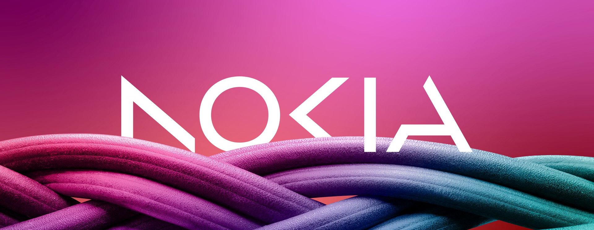
Nokia, the once-dominant smartphone company, has unveiled a new logo for the first time in almost six decades. The new logo marks a significant departure from the previous design, featuring a modern and digital look rather than the iconic typeface and "Yale blue" color scheme. The change is part of the company's effort to update its brand identity and align it with its current strategy as a business-to-business technology innovation leader focused on networks and industrial digitalization.
According to Nokia CEO Pekka Lundmark, the company wants to move away from the legacy mobile phone image and focus on its core business of networks and industrial digitalization. While many people still associate Nokia with mobile phones, the company has not been involved in the phone business since Microsoft's acquisition of its Devices and Services division in 2014. HMD Global, a company made up of former Nokia executives, now owns the rights to use the Nokia brand for smartphones and tablets, and recently announced its latest device, the G22, which features the classic Nokia logo.
It remains to be seen whether HMD Global will continue to use the classic logo in the future. However, Nokia's new logo reflects the company's evolving strategy and signals a new chapter in its history as a technology innovator.


Editor’s pick