08:30
Pavel Durov questioned again in Paris for over six hours

08:00
OpenAI launches GPT-Live, a new generation of voice models for ChatGPT

22:00
China warns of alleged backdoor in Anthropic’s Claude Code

14:13
GPT-5.6 set for public release after US lifts restrictions

13:00
US companies are turning to cheaper Chinese AI models as costs rise

10:00
Claude Cowork is coming to mobile and the web with background tasks
08:30
Pavel Durov questioned again in Paris for over six hours
08:00
OpenAI launches GPT-Live, a new generation of voice models for ChatGPT
22:00
China warns of alleged backdoor in Anthropic’s Claude Code
14:13
GPT-5.6 set for public release after US lifts restrictions
13:00
US companies are turning to cheaper Chinese AI models as costs rise
10:00
Claude Cowork is coming to mobile and the web with background tasks
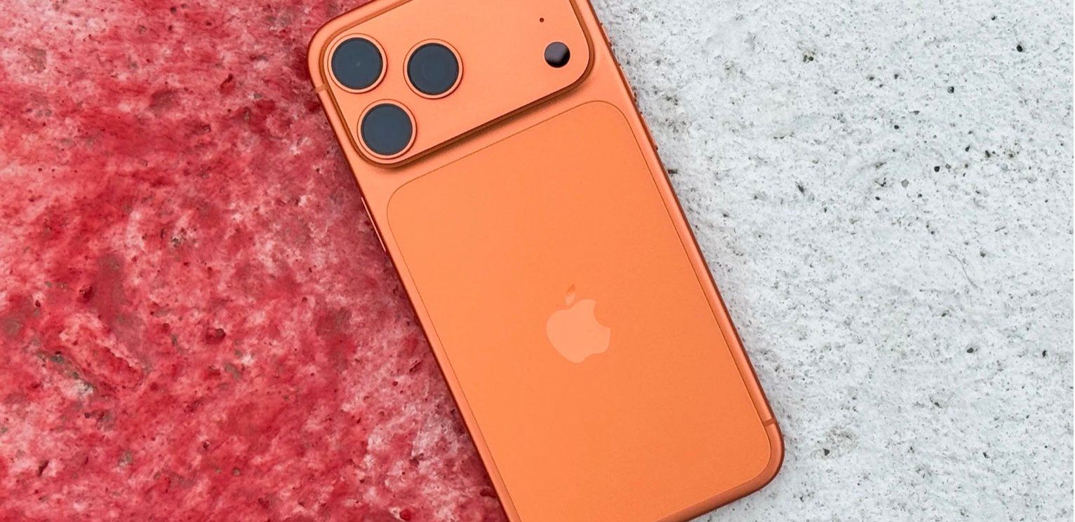
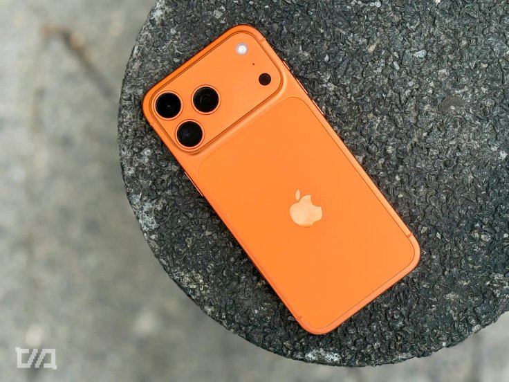
Why you shouldn’t buy the orange iPhone 17 Pro Max
I’ve been using Apple’s new iPhone 17 Pro Max for a week, and I’ve come to an unexpected conclusion. Apple might have created the most unfortunate color in the history of the iPhone.
Everyone has their personal taste, but this time there’s one shade that does something unusual. It charms you at first, then slowly drives you mad.
First Impressions: Stunning!
When Apple unveiled the iPhone 17 Pro Max in orange, I thought — wow, Cupertino still knows how to surprise people. The marketing worked. The phone looked emotional, not just bright, and stood out against the usual gray and blue tones. In photos it glowed like it had been lifted from a sunset, a perfect balance of warmth and confidence. It made you want to hold it and feel that burst of color.
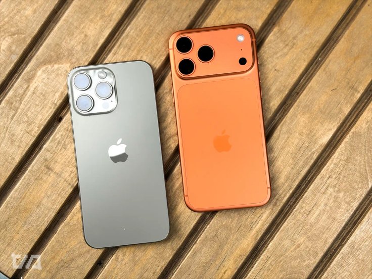
I’d spent the past year with an iPhone 16 Pro Max in Natural Titanium. Calm, quiet, invisible. The kind of phone that doesn’t demand your attention, which is exactly what makes it pleasant. Practical, yes, but boring. So when the new “sunny” iPhone arrived, I thought maybe it was time for some color in my life. Spoiler, it wasn't.
Within days, I realized I was holding not a smartphone but a constant source of visual distraction. The color that seemed so lively in the store turned into something I wanted to escape from. If you’re thinking about getting the orange iPhone 17 Pro Max, don’t. What looks stunning under retail lighting quickly becomes exhausting in daily use.
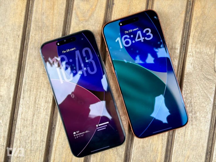
When the frame becomes the main character
The biggest issue is the bright frame around the display. It’s always there, catching the corner of your eye. You’re reading messages or browsing the web, and the orange edge keeps pulling your attention away, as if something is flashing in your peripheral vision.
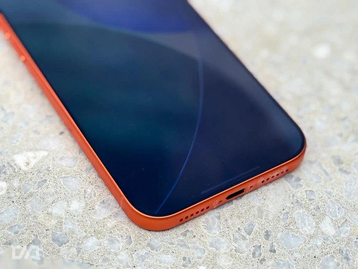
With a neutral frame, the display stands out. With an orange one, your eyes never rest. It’s like someone constantly drawing attention to the edges of the screen. After a while it becomes tiring. You just want the phone to disappear and let you focus.
It’s a little like playing a game where everything you need to click glows. The orange iPhone gives off the same feeling — only this time it’s real life, not a game.
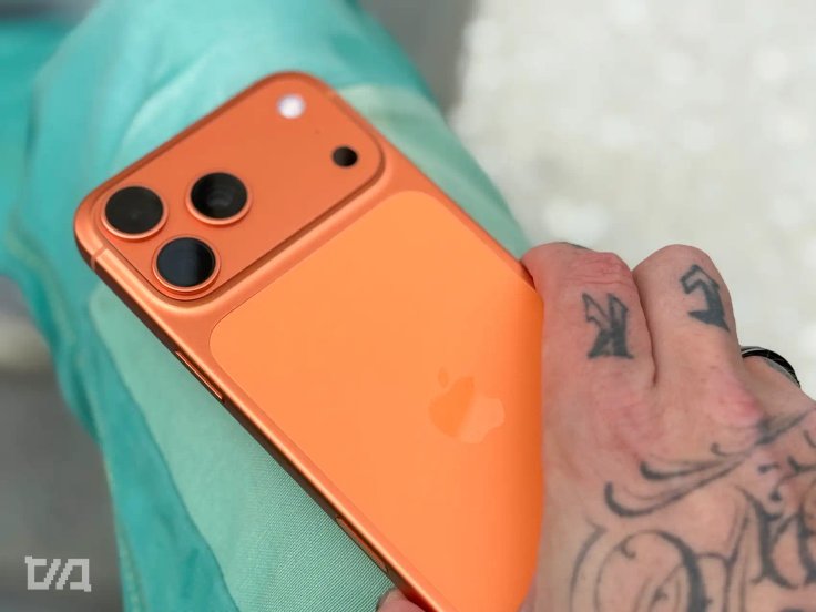
The phone you want to hide
Here’s the irony. The orange iPhone almost forces you to buy a case. Any case, as long as it covers the color.
For the first couple of days you’re proud of it, catching looks in cafés and trains, but soon you realize the phone is louder than you are. It keeps drawing attention to itself, even when you don’t want it to.
And let’s be honest, it’s not exactly the safest choice. A bright phone doesn’t just catch eyes for the right reasons, it also catches the wrong ones. In a crowded place, that flash of orange can attract attention from people you’d rather avoid. And no one really needs that.
Eventually you end up with a matte, neutral case just to tone it down. The color that once looked exciting now feels like something you have to manage. The performance is over before it even started.
A style headache
Finding matching accessories becomes another challenge. The orange finish clashes with almost everything. Power banks, MagSafe wallets, even cables never seem to look right next to it. Instead of a clean setup, you end up with a mess of colors that fight for attention.
And if you go without a case, every tiny scratch and scuff will show. One week of careful use isn’t enough to prove it, but experience says this shade won’t age gracefully.
Harder to sell later
Most iPhone owners eventually sell their phone before upgrading. That’s when orange turns into a problem again. People love to admire bold colors, but they rarely buy them.
Buyers usually choose the classics: gray, silver, white. Orange becomes the color that everyone talks about but no one actually wants. If you don’t want to be stuck with listings for weeks, it’s safer to go with a tone that doesn’t go out of style.
And in a business setting, the orange iPhone doesn’t exactly say professionalism. It looks playful, almost toy-like, among laptops and neutral devices. There’s nothing wrong with that if it matches your personality, but if you’re trying to project “a serious person energy,” this phone won’t help.
Verdict: bright isn’t always better
The orange iPhone 17 Pro Max is beautiful, striking, and incredibly photogenic. But it’s a color designed for the store, not for everyday life. It distracts, tires your eyes, clashes with accessories, and constantly reminds you that it’s there.
After a year with Natural Titanium, I’ve come to appreciate calm colors even more. They don’t shout. They don’t compete with the content. They simply exist.
If you want an iPhone that feels like an extension of you instead of a statement piece, go for dark blue or white. The best color is the one that lets you forget about it. And that’s definitely not bright orange.


Editor’s pick