17:00
Tesla launches a $225 balance bike for kids

12:47
Caviar's latest collection lets you choose between Messi and Ronaldo

10:00
Moonshot unveils Kimi K3, claims it is the world's largest open AI model

14:46
OpenAI unveils Codex Micro, a hardware controller for AI agents

14:00
Dubai launches public driverless taxi service

11:00
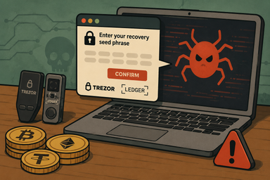
New malware platform steals crypto wallet seed phrases
17:00
Tesla launches a $225 balance bike for kids
12:47
Caviar's latest collection lets you choose between Messi and Ronaldo
10:00
Moonshot unveils Kimi K3, claims it is the world's largest open AI model
14:46
OpenAI unveils Codex Micro, a hardware controller for AI agents
14:00
Dubai launches public driverless taxi service
11:00
New malware platform steals crypto wallet seed phrases

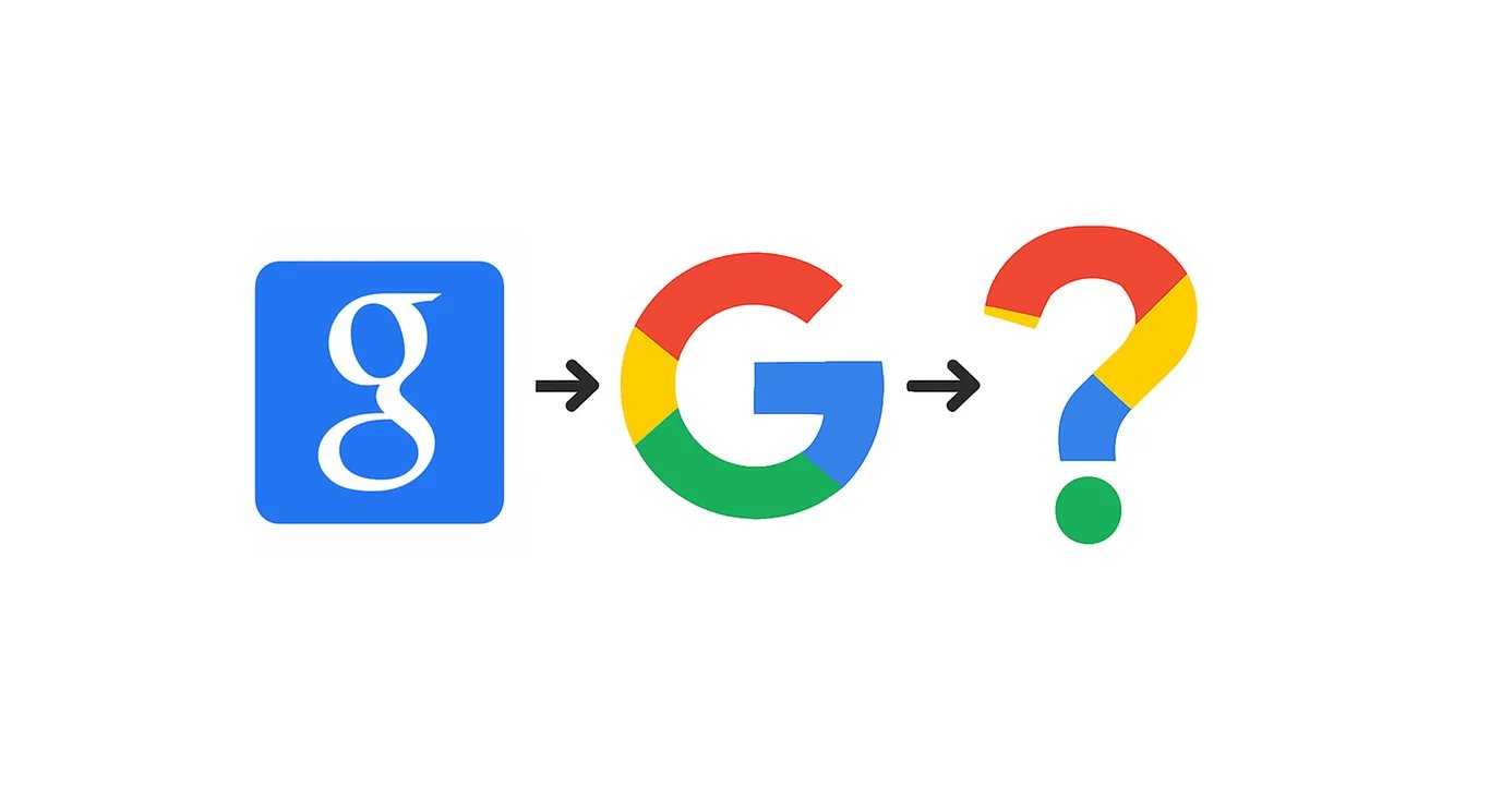
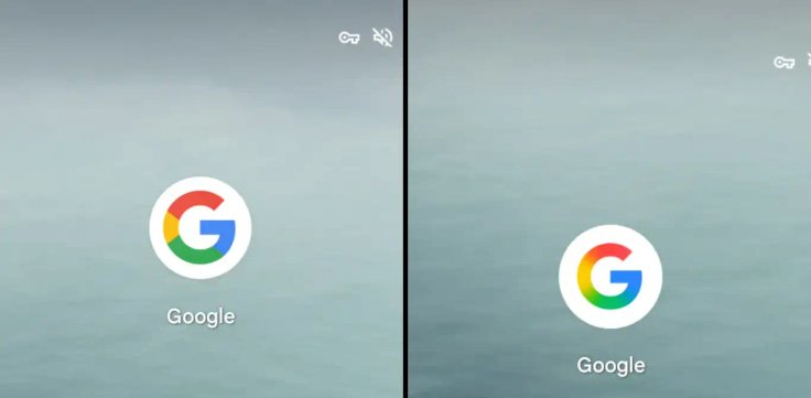
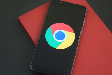
For the first time in a decade, Google has updated its iconic "G" logo, reports 9to5Google.
The new design no longer features the four distinct color sections. Instead, the colors now blend seamlessly into one another, creating a gradient effect similar to the design of Gemini.
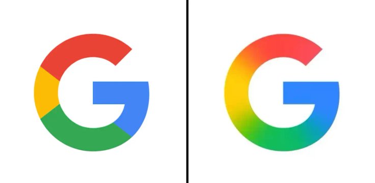
The updated icon has already appeared in Google Search for iOS and the Google app on Android 16.18 (beta). It will soon replace the browser icon as well.
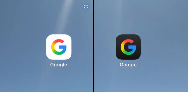
Google’s main six-letter logo remains unchanged for now, and it’s unclear whether the company plans to update it. One user joked that Google should revamp all its icons — especially to make Google Home look less like Google Drive.


Editor’s pick