16:31
Samsung reportedly cuts phone production by up to 30% as memory costs soar

12:52
Anthropic cuts Claude API prices with Haiku 5.5

12:21
ChatGPT gets interactive tools and faster answers with GPT-6

11:04
South Korean hospital camera footage of patients leaked to porn sites

17:40
Google launches Playground to turn text prompts into playable games

13:09
OpenAI releases 722 AI math papers amid criticism from mathematicians
16:31
Samsung reportedly cuts phone production by up to 30% as memory costs soar
12:52
Anthropic cuts Claude API prices with Haiku 5.5
12:21
ChatGPT gets interactive tools and faster answers with GPT-6
11:04
South Korean hospital camera footage of patients leaked to porn sites
17:40
Google launches Playground to turn text prompts into playable games
13:09
OpenAI releases 722 AI math papers amid criticism from mathematicians
16:31
Samsung reportedly cuts phone production by up to 30% as memory costs soar
12:52
Anthropic cuts Claude API prices with Haiku 5.5
12:21
ChatGPT gets interactive tools and faster answers with GPT-6
11:04
South Korean hospital camera footage of patients leaked to porn sites
17:40
Google launches Playground to turn text prompts into playable games
13:09
OpenAI releases 722 AI math papers amid criticism from mathematicians
16:31
Samsung reportedly cuts phone production by up to 30% as memory costs soar
12:52
Anthropic cuts Claude API prices with Haiku 5.5
12:21
ChatGPT gets interactive tools and faster answers with GPT-6
11:04
South Korean hospital camera footage of patients leaked to porn sites
17:40
Google launches Playground to turn text prompts into playable games
13:09
OpenAI releases 722 AI math papers amid criticism from mathematicians

Instagram has redesigned the wordmark that appears at the top of its app for the first time in a decade as part of a broader brand refresh. The familiar camera icon remains unchanged, while users are already joking that the new lettering looks more like “Instagzam.”
Instagram head Adam Mosseri announced the change, TechCrunch reports, saying the previous wordmark had been in place for 10 years and was due for an update.
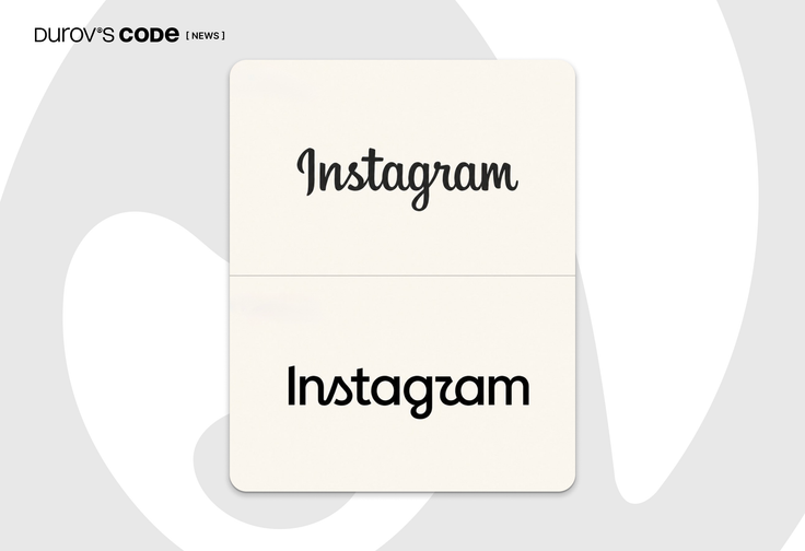
Mosseri described the new design as “sharper and more modern” while still referencing the original. In practice, Instagram is moving away from its signature cursive lettering toward a cleaner, more sans-serif-like design, while retaining a few distinctive flourishes in letters such as the “g” and “r.” The shape of the “r” in particular has attracted much of the attention.
Mosseri’s post quickly filled with jokes that the redesigned wordmark reads more like “Instagzam” than Instagram. Some design publications have also questioned its legibility, while others have praised the cleaner, more contemporary look. Any change to a logo this prominent is inevitably going to be scrutinized almost immediately by billions of people, with Instagram’s monthly user base surpassing 3 billion in fall 2025.







Editor’s pick