17:00
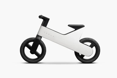
Tesla launches a $225 balance bike for kids

12:47
Caviar's latest collection lets you choose between Messi and Ronaldo

10:00
Moonshot unveils Kimi K3, claims it is the world's largest open AI model

14:46
OpenAI unveils Codex Micro, a hardware controller for AI agents

14:00
Dubai launches public driverless taxi service

11:00
New malware platform steals crypto wallet seed phrases
17:00
Tesla launches a $225 balance bike for kids
12:47
Caviar's latest collection lets you choose between Messi and Ronaldo
10:00
Moonshot unveils Kimi K3, claims it is the world's largest open AI model
14:46
OpenAI unveils Codex Micro, a hardware controller for AI agents
14:00
Dubai launches public driverless taxi service
11:00
New malware platform steals crypto wallet seed phrases


Amazon has refreshed its logo — the first rebranding in two decades — giving a new look to the iconic "smile."
The new design was developed in collaboration with the design agency Koto, known for projects with brands like Airbnb, Fanta, and BlaBlaCar. The most notable change is the signature "smile-arrow," which now features a vibrant mandarin color and appears wider and more welcoming.
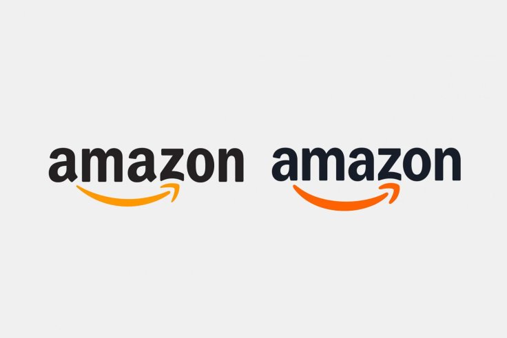
“Our update puts greater emphasis not on the arrow, but on a deeper and more emphatic smile, reflecting Amazon's mission to delight customers and make their lives easier,” commented Koto on the logo update.
The refresh covers more than 50 Amazon sub-brands, including Amazon Smile and Alexa. The new design unifies their logos with the updated "smile."

We built a new brand system that elevates Amazon's most iconic assets: a warmer smile, a modernized logo, a flexible new typeface, a unified color palette, and a global architecture designed to move at the pace of Amazon.
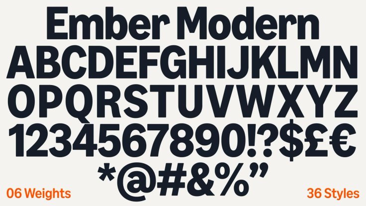
The global update also includes a new custom font, Amazon Logo Sans, which has been integrated into Amazon Smile, Amazon Cash, Amazon Echo, and Amazon Jobs. Additionally, the company has updated its signature Ember font, used across the entire organization.
The redesign took 18 months to complete, according to Koto. The new visual identity will be implemented across all company assets, including the website, packaging, and employee uniforms.


Editor’s pick