12:00
Major publishers consider blocking Googlebot as AI search slashes traffic

08:30
Apple plans to refresh its entire Mac lineup with around 11 new models

21:00
Samsung reveals smart glasses powered by Gemini

15:00
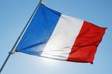
France bans social media for children under 15

14:12
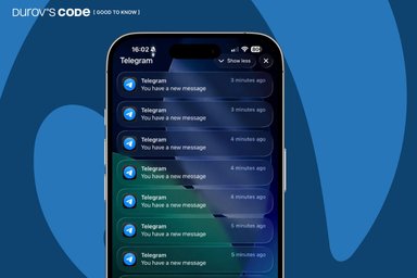
Telegram bug causes iPhone overheating and hundreds of fake notifications. How to fix it

12:00
YouTube will stop paying for low-quality AI content
12:00
Major publishers consider blocking Googlebot as AI search slashes traffic
08:30
Apple plans to refresh its entire Mac lineup with around 11 new models
21:00
Samsung reveals smart glasses powered by Gemini
15:00
France bans social media for children under 15
14:12
Telegram bug causes iPhone overheating and hundreds of fake notifications. How to fix it
12:00
YouTube will stop paying for low-quality AI content


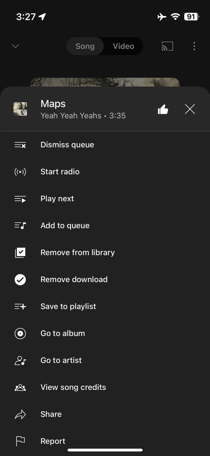
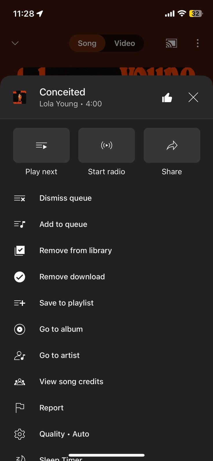
YouTube Music is undergoing a menu redesign, aiming to address the cluttered three-dot overflow menu that users have found overwhelming.
In this new design, Google has introduced large buttons at the top to highlight three actions: "Play next," "Start radio," and "Share." While these actions are already near the top of the list, it remains to be seen if they will be selected contextually or dynamically based on user interactions. This redesigned menu is visible on the Now Playing page but is expected to appear throughout the YouTube Music app.
In the screenshot provided, it's evident that the entire menu isn't fully displayed, requiring users to scroll through it. Despite recent additions like "View song credits" and "Sleep Timer," the goal is to create a more streamlined menu that doesn't require further expansion.
It's important to note that this menu redesign for YouTube Music is not yet widely available on all devices, and it may roll out gradually to users in the future.


Editor’s pick