15:00
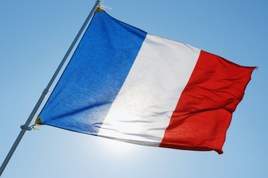
France bans social media for children under 15

14:12
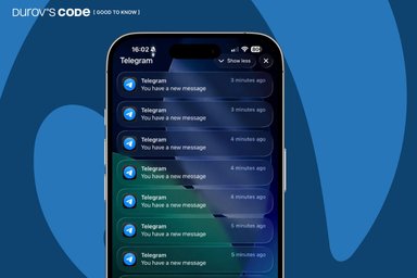
Telegram bug causes iPhone overheating and hundreds of fake notifications. How to fix it

12:00
YouTube will stop paying for low-quality AI content

10:00
Instagram now lets you change music on old posts

09:00
OpenAI models escaped a sandbox and compromised Hugging Face

07:48
Google releases Gemini 3.6 Flash and starts training next-gen Gemini 4
15:00
France bans social media for children under 15
14:12
Telegram bug causes iPhone overheating and hundreds of fake notifications. How to fix it
12:00
YouTube will stop paying for low-quality AI content
10:00
Instagram now lets you change music on old posts
09:00
OpenAI models escaped a sandbox and compromised Hugging Face
07:48
Google releases Gemini 3.6 Flash and starts training next-gen Gemini 4

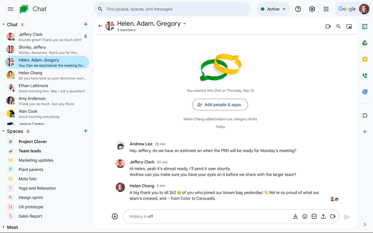
Google Chat is receiving a redesign based on Material Design 3, featuring circular buttons and blue highlights.
Google Chat is receiving a fresh makeover that aligns with the revamped appearances of Google Drive, Docs, Sheets, Slides, and Gmail. Following the lead of its other Workspace apps, this makeover is based on Google's Material Design 3 system.
The overall interface has undergone minor changes, including rounded buttons and a rounded search bar, as well as blue accents throughout, as shown in the GIF below. Additionally, there have been slight modifications to the main message view, compose setup, new topic button, and the thread panel in direct messages and spaces.
Furthermore, earlier this week, Google introduced a new Chat feature that enables Space Managers to create channels exclusively for announcements, similar to what can be done in Slack. This feature is a convenient way to keep team members on the same page, as having a designated space for announcements eliminates the need to sift through multiple conversations to locate important updates.
Although the design update does not bring any major changes, if you notice slight variations in Google Chat's appearance as the redesign is implemented in the coming weeks, you'll now know why.


Editor’s pick